More screen does not mean more message
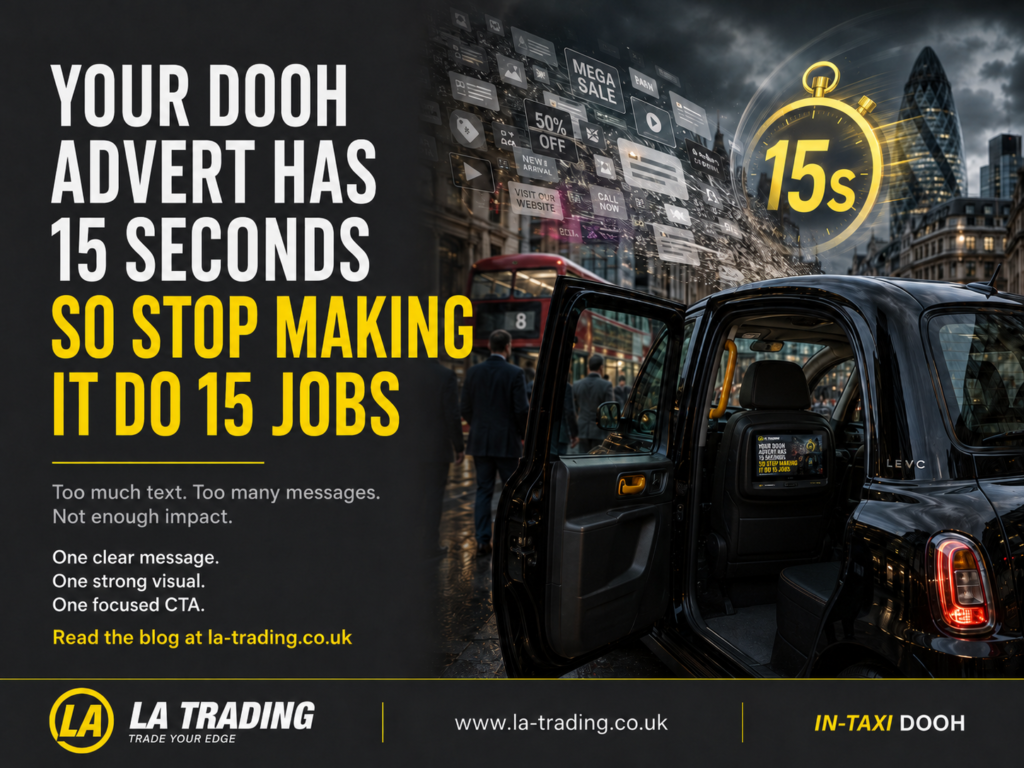
Digital screens give marketers flexibility.
They can display motion, multiple frames, changing information, QR codes, location-based messaging and campaign variations. Unfortunately, that flexibility sometimes encourages brands to include everything simply because they can.
The result is often technically impressive but mentally exhausting.
A passenger should not need to:
- Decode a paragraph.
- Memorise several offers.
- Understand the full history of the company.
- Select between four calls to action.
- Read terms and conditions at the speed of an auctioneer.
The best DOOH creative normally has a hierarchy:
- One strong hook
- One useful or memorable message
- One clear next step
Everything else should justify its place.
Decide what the advert is actually for
Before opening Photoshop, After Effects or any other creative software, ask one question:
What should someone think, feel or do after seeing this?
Those are three different campaign goals.
Think
You may want the audience to remember that your brand exists, has launched locally or offers something distinctive.
The advert should prioritise:
- Brand recognition
- A simple proposition
- A memorable visual
- Consistent campaign assets
Feel
You may want someone to feel curious, reassured, amused, excited or hungry.
The advert should prioritise:
- Emotional imagery
- Human language
- A recognisable situation
- Tone and personality
Do
You may want the audience to scan, book, visit, enquire or download.
The advert should prioritise:
- A clear benefit
- An immediate reason to act
- A simple CTA
- A suitable QR or destination
A single advert can support more than one objective, but one should always lead.
Design for the environment, not just the brand guidelines
A beautiful advert on a laptop is not automatically a strong DOOH advert.
Creative needs to be judged where people will actually see it.
That means considering:
- Screen dimensions
- Viewing distance
- Lighting
- Dwell time
- Passenger position
- Message rotation
- The surrounding environment
Inside a taxi, the brand enters a very different setting from a roadside poster or social feed.
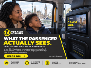
The passenger is seated. The screen is within their natural field of view. The journey can provide repeated exposure over several minutes rather than one brief passing glance.
LA Trading’s internal taxi screen network is designed around journeys lasting approximately 10–30 minutes, giving advertisers the opportunity to build familiarity in a focused passenger environment.
This does not mean the advert should become longer or more complicated.
It means the creative can be calmer.
It has space to breathe.
Start with a sentence a real person might say
Marketing language often becomes less persuasive when it tries too hard to sound like marketing.
Consider the difference:
Delivering innovative, customer-centric solutions across multiple verticals.
And:
Need it delivered today? We can help.
The first sounds impressive until you realise it does not clearly say anything.
The second gives the audience something they can immediately understand.
For DOOH creative in 2026, human language is not a stylistic bonus. It is a competitive advantage.
Try writing your headline as though you were explaining the offer to someone sitting opposite you.
Then remove the unnecessary words.
Then remove another three.
Use motion to guide attention—not decorate the screen
Motion should help the audience understand the message.
It can:
- Reveal information in the correct order.
- Direct attention towards the product.
- Demonstrate an app or service.
- Bring emotion and energy to the creative.
- Make the CTA easier to notice.
It should not make every element fly, spin, bounce and flash simply because someone discovered the animation controls.
A useful test is to watch the advert once without sound.
After one viewing, can you answer:
- Who is advertising?
- What are they offering?
- Why should someone care?
- What happens next?
When the answer is no, more animation is unlikely to solve the problem.
Give the QR code a reason to exist
“Scan here” is an instruction.
It is not a motivation.
People scan when they understand what they will receive:
- Scan to claim the passenger offer.
- Scan to book a free consultation.
- Scan to view homes available nearby.
- Scan to download the city guide.
- Scan to enter before midnight.
The destination must also match the message.
Do not send an interested passenger to a generic homepage and expect them to begin an online treasure hunt.
Create a relevant landing page, simplify the form and make the next action obvious.
Build a creative system, not one lonely advert
The strongest campaigns do not necessarily rely on a single execution.
They use a consistent creative idea that can be adapted across:
- Traditional OOH
- Large-format DOOH
- In-taxi screens
- Social content
- Landing pages
- Retail or event activations
The visual identity remains recognisable, but the message changes to suit each environment.
A roadside placement may create broad awareness.
An internal taxi advert can deepen the message, introduce the next action or reinforce the brand during the passenger journey.
This is not about replacing one OOH format with another.
It is about allowing each part of the campaign to perform the job it is best suited to do.
The five-second creative check
Before approving your next advert, ask five people who were not involved in creating it to view it once.
Then ask them:
- Which brand was it?
- What was the main message?
- What stood out?
- What were they being asked to do?
- How did the advert make them feel?
Do not explain the advert afterwards.
That ruins the test.
When five people give five completely different answers, the creative may need another round.
Conclusion: your logo is not being paid by the word
There is a strange temptation in advertising to fill every available space.
Perhaps empty space looks unemployed.
But clarity is not wasted space. It is what allows the important parts of an advert to work.
A strong DOOH advert does not tell the audience everything.
It gives them one valuable reason to remember the brand—and one easy way to continue the relationship.
LA Trading helps advertisers bring their campaigns into the passenger journey through geo-targeted digital screens inside taxis across the UK. We can support brands with campaign planning, creative mock-ups and location-based opportunities designed to complement wider OOH activity.
Have a campaign that currently contains more messages than a family WhatsApp group?
Send it to us. We will help you identify the idea passengers actually need to see.
Book a strategy call with LA Trading or request