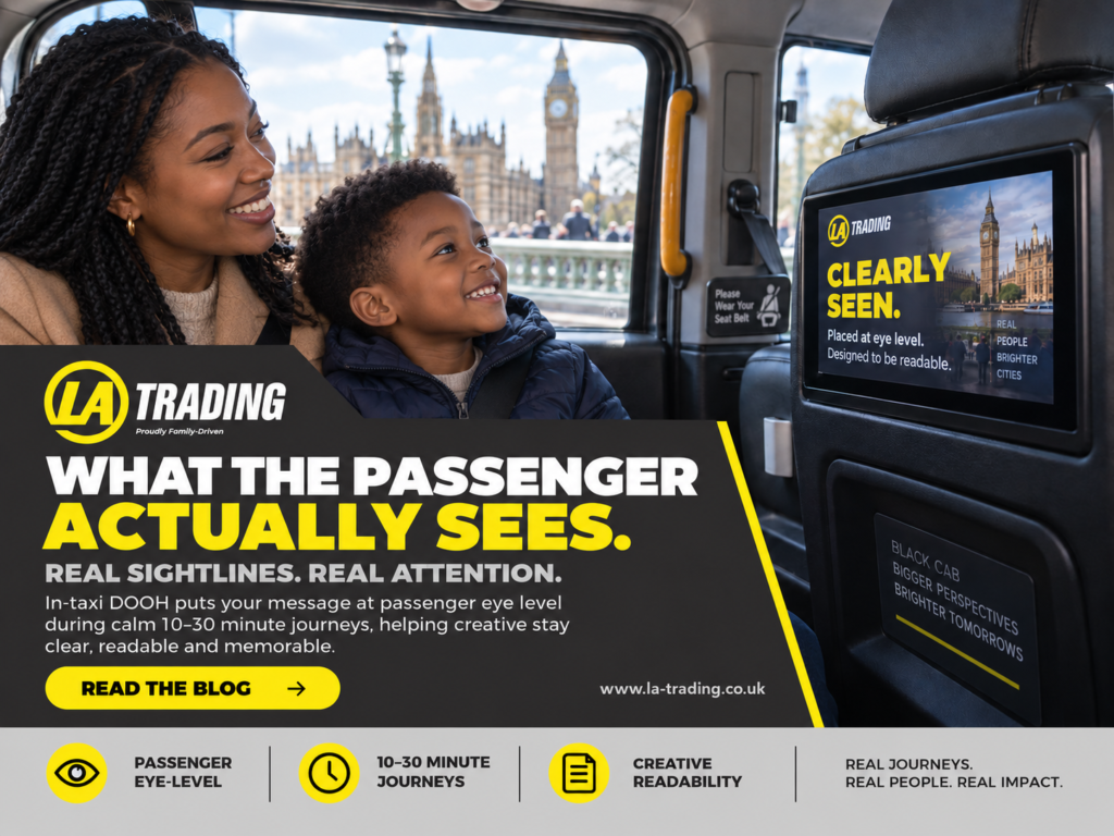
Start with the actual sightline
In-taxi DOOH is not a giant roadside screen.
It is not a phone held 20 centimetres from somebody’s face.
And it is not a laptop mock-up being viewed in a design meeting.
It is a screen positioned inside the taxi, in front of the passenger during the journey.
That changes the creative problem.
The passenger should not have to:
- lean forward
- turn awkwardly
- search for the screen
- squint at tiny copy
- decipher six competing messages
- work out what the advert is trying to sell
If the campaign needs that much effort, the creative is already making life unnecessarily difficult.
Good in-taxi creative should feel immediately understandable.
The screen is there.
The passenger is there.
The message should do the rest.
Screen position changes how creative should be designed
OOH specialists already understand that environment affects creative.
A roadside execution is designed for distance and movement.
Rail media works within commuter behaviour.
Retail media sits closer to shopping intent.
Large-format DOOH can create enormous public visual moments.
In-taxi DOOH adds another environment to that mix:
a digital screen inside a relatively contained passenger journey.
LA Trading’s screens sit inside taxis, where passengers may spend around 10–30 minutes travelling. That gives advertisers a very different viewing context from fast-scroll digital media or high-speed roadside exposure.
It does not mean the advert should contain ten minutes of information.
Quite the opposite.
More available time should create more confidence, not more clutter.
Your Photoshop file is not the passenger experience
This is where creative teams can occasionally get caught out.
The advert looks beautiful on a 27-inch monitor.
The legal copy is technically readable.
The QR code exists.
Everyone approves it.
Then the campaign appears on the actual screen and suddenly:
the headline is too small,
the supporting copy has become decorative texture,
and the CTA appears to have applied for witness protection.
That is why a proper campaign mock-up matters.
Before launch, the useful question is not simply:
“Does the artwork look good?”
It is:
“Does it work at the actual viewing size?”
That distinction can save a lot of disappointing creative.
Dwell time gives brands an opportunity — not permission to overload
One of the interesting advantages of the taxi environment is the journey itself.
Passengers are not simply walking past the screen.
They remain within the environment while travelling.
That can give brands repeated opportunities to be noticed during the journey.
But this is where restraint becomes important.
LA Trading has already discussed creative frequency elsewhere: repetition becomes more useful when the message is worth seeing again and when additional executions contribute something rather than simply repeating weak creative more often.
The same principle applies to readability.
A longer passenger journey should not encourage:
MORE COPY. MORE ICONS. MORE DISCLAIMERS. MORE EVERYTHING.
It should encourage a clearer hierarchy.
For example:
First glance:
What is the brand?
Second glance:
What is the message?
Third glance:
Is there something useful I can do?
That is a much healthier creative journey.
The five-second readability test
Here is a simple test agencies and brand managers can use before approving an in-taxi campaign.
Look at the creative at roughly the size it will appear to the passenger.
Give yourself five seconds.
Then ask:
1. Can you identify the brand?
If not, brand recognition is going to struggle.
2. Can you understand the main message?
Not the entire brochure.
The main idea.
3. Is the headline doing most of the work?
It should be.
4. Is the CTA obvious?
If you want someone to scan, visit, book or remember something, that action needs visual priority.
5. Could anything be removed?
This is usually the painful one.
Creative teams love everything they put into the artwork.
Passengers do not share that emotional attachment.
Sometimes removing three things improves the other seven.
Bigger type usually beats more type
There is a strange temptation in advertising to treat empty space as an emergency.
It is not.
A little breathing room can make a message substantially easier to absorb.
For in-taxi DOOH, strong creative will usually benefit from:
- a clear headline
- recognisable branding
- strong contrast
- limited supporting copy
- one obvious CTA
- properly sized QR codes where relevant
- simple visual hierarchy
- enough space between elements
The screen does not need to look empty.
It needs to look intentional.
That is different.
What about video?
Video creates additional opportunities because the message can develop over time.
But again, the passenger should not need to solve a puzzle.
A short sequence might work as:
Frame 1: brand + problem
Frame 2: solution or benefit
Frame 3: CTA
Simple.
Readable.
Easy to follow.
The strength of digital OOH is flexibility. It allows advertisers to change creative, rotate messaging and adapt content rather than forcing one static execution to do everything.
That flexibility should improve clarity.
Not create a miniature television documentary.
Where in-taxi DOOH fits alongside wider OOH
This is not about suggesting passenger screens replace traditional OOH.
They serve different roles.
Large-format OOH can create scale, fame and public presence.
Transit media can build frequency through movement and routine.
In-taxi DOOH can provide a more contained digital moment during the passenger journey.
That combination can be particularly useful when the creative has been designed for each environment rather than simply resized across all of them.
LA Trading’s existing work around transit and connected OOH makes the same broader point: passenger media can complement wider OOH by adding another real-world touchpoint while audiences move between places.
The goal is not to crown a winner.
It is to use each environment properly.
Agencies should ask to see the campaign in context
This is perhaps the most practical point.
If you are planning in-taxi media for a client, ask to see the creative inside the actual format.
Not just the raw JPEG.
Not just the presentation slide.
The real viewing context.
A strong mock-up should help you judge:
- screen scale
- viewing distance
- headline size
- brand prominence
- CTA visibility
- QR placement
- colour contrast
- overall readability
That makes approvals easier.
It also gives clients a much more realistic idea of what they are buying.
The best advert is often the one that knows when to stop
There is always another thing you could add.
Another statistic.
Another benefit.
Another badge.
Another line of copy.
Another logo.
Another tiny icon nobody requested.
Eventually somebody has to be brave enough to say:
That’s enough.
Because the passenger does not need your entire sales deck.
They need a clear reason to notice, understand and remember the brand.
That is the job.
Final thought
The interesting thing about in-taxi DOOH is not simply that there is a screen inside a vehicle.
It is the environment around that screen.
A seated passenger.
A real journey.
A clear sightline.
Time to notice.
And creative that has been designed with that reality in mind.
So before approving your next campaign, zoom out from the artwork file for a moment.
Imagine sitting in the back of the taxi.
Would you understand it?
Would you remember it?
Would you know what to do next?
If the answer is yes, brilliant.
If the answer is:
“Hang on, let me zoom in…”
we probably have some work to do.
Want to see what your campaign would actually look like inside the taxi?
Send LA Trading your existing artwork and we’ll create a campaign mock-up showing how it sits within the real passenger environment before you commit to the media